
Custom Wine Labels: Crafting a Distinct Identity for Your Bottle
2026-05-27
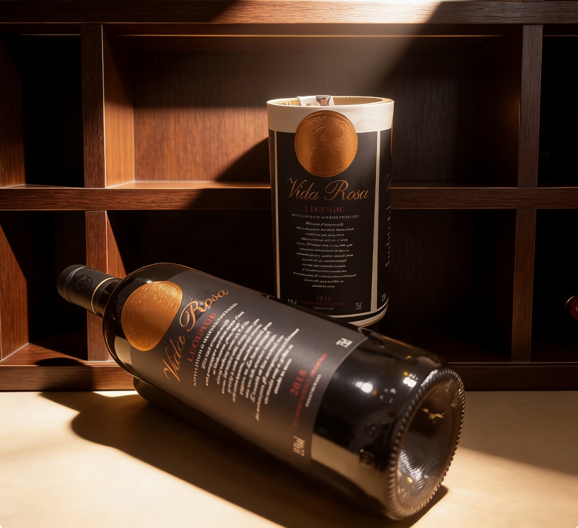
A bottle of wine tells a story before the cork even pops. The label is that first whisper—it shapes expectations, sparks curiosity, and sets the mood. With custom wine labels from Xinsen, you're not just branding a bottle; you're bottling a distinct identity that lingers long after the last sip. Ready to turn your wine into an unforgettable experience? Let's explore how thoughtful design and quality printing make every detail count.
Uncork the Unexpected: Label Designs That Break the Mold
In a sea of polished, predictable bottles, some labels refuse to play it safe. They shred the rulebook, playing with texture, typography, and color in ways that stop you mid-aisle. Here, innovation isn’t just aesthetic—it’s a conversation starter, daring you to ask: what exactly is inside?
From hidden illustrations that reveal themselves only when chilled, to typography that wraps around the bottle like a whispered secret, these designs transform the act of choosing a drink into an experience. They’re never about shouting loudest; instead, they intrigue through mischief, surprise, and subversion.
We’re seeing labels that double as keepsakes: one winery uses seed-embedded paper that can be planted after use, while another incorporates heat-sensitive ink that shifts patterns with your grip. These aren’t just packages; they’re invitations to engage, to peel back layers, and to remember a story long after the last sip.
Bottle Poetry: Weaving Words and Art
In the quiet space where verse meets vessel, bottle poetry emerges as a delicate dance between language and form. Words are not merely written but carefully etched, painted, or embedded onto glass, ceramic, or clay, transforming an ordinary container into a vessel of meaning. Each bottle becomes a canvas, its curves and contours guiding the flow of stanzas, turning a functional object into a tactile poem you can hold in your hands.
This fusion of art and literature invites a slower kind of engagement. You might trace the letters with your fingertips, feeling the texture of the verse as light filters through the glass, casting letter-shaped shadows. The choice of materials—whether a weathered wine bottle bearing a somber sonnet or a slender perfume flask adorned with haiku—deepens the conversation between sight, touch, and sound. Through bottle poetry, everyday objects are reimagined as intimate expressions of creativity, where stories are contained and yet constantly released.
Your Label, Your Legacy: Personal Touches That Resonate
A label is never just ink on paper or a name stitched into fabric. It's a quiet introduction, a whisper of who you are before you even speak. When you weave your personality into every detail—the curve of a handwritten note, the choice of a ribbon, the scent lingering on a package—you're not just marking an object. You're placing a fragment of yourself into someone else's hands, something that carries the weight of your story. Those small, considered touches turn the ordinary into something intimate, something that lingers in memory long after the moment has passed.
People forget products and services, but they rarely forget how you made them feel. The grain of natural paper, a splatter of wax seal, a phrase only you would think to write—these are the echoes that stay. They tell a story of care that no mass-produced gesture can match. And in a world that often feels rushed and impersonal, that kind of intention stands out like a hand reached out in a crowd. It says, “I see you; this was made for you.”
What you leave behind isn't just a transaction; it's a relationship. Every box you pack, every label you design, every surprise tucked inside is a stitch in a much larger tapestry. Over time, these threads weave a legacy—not of grand gestures, but of consistent, heartfelt presence. Your label becomes a promise, your touch a signature. And each time someone returns to it, they're not just revisiting a product; they're reconnecting with a piece of your world, a world they now carry with them.
Beyond Paper: Unconventional Materials for Standout Labels
Labels have long escaped the paper box. Wood veneer brings a tactile warmth that feels organic and premium—perfect for spirits or artisanal goods. Its grain variations make every piece subtly unique, turning a simple tag into a miniature piece of craftsmanship.
Fabric labels add softness and durability, often outlasting the products they tag. Canvas or woven cotton creates a homespun feel, while silk or satin suggests luxury. They take ink beautifully but also work with embroidery, offering depth that flat printing can't match.
Then there are metals—brushed aluminum or copper foil—that bring an industrial edge or vintage shimmer. They resist weather, won't tear, and catch light in ways that demand attention. For brands willing to experiment, slate, leather, or even recycled rubber can forge a tactile identity that shoppers instinctively reach out to touch.
Sensory Design: Engaging More Than Just Sight
Most digital experiences still lean heavily on visual cues, but genuine sensory design pushes beyond the screen. Sound can shape mood faster than a color palette—soft ambient tones calm users during wait screens, while layered feedback clicks make interfaces feel tactile and responsive. Even the weight of a door handle or the temperature of a surface affects perception, and these primal cues are slowly making their way into virtual spaces through haptic engines and audio textures.
Scent and texture remain largely untapped in mainstream tech, yet they anchor memory and emotion like few other senses can. A subtle, pleasant aroma in a retail app’s physical companion store can transform browsing into a lingering ritual. In UX, materials matter: the coolness of polished concrete underfoot, the satisfying heft of a ceramic mug, the faint give of a leather chair—all shape decisions long before logic kicks in. Designing for these layers means thinking beyond pixels and considering the entire body as an interface.
True sensory design isn’t about adding gimmicks; it’s about sequencing multi-sensory inputs that reinforce a narrative. A museum exhibit that pairs low-frequency hums with dim, warm light can shift a visitor’s breathing rhythm. A meditation app that uses haptic pulses synced with slow exhalation invites a deeper state than voice guidance alone. When sight is just one part of a larger choreography, experiences become immersive not because they’re flashy, but because they feel whole.
The Art of Shelf Appeal: Winning the Visual Race
In a world saturated with choices, a product has only a heartbeat to catch a shopper’s eye. The subtle dance of color, shape, and typography can make the difference between being picked up or passed over. It’s not about being the loudest on the shelf, but about whispering the right visual promise to the right person at the right moment.
Consider the silent narrative that unfolds in those fleeting seconds. A well-placed gradient might evoke a sense of modern sophistication, while a matte finish signals understated quality. The true art is weaving these elements into a cohesive story that feels inevitable, as if the product couldn’t possibly look any other way. This isn’t just packaging; it’s context sculpted into a three-dimensional invitation.
The race isn’t won by mere visibility; it’s won by resonance. When the design aligns so perfectly with a shopper’s unspoken desire that choosing it feels like an instinct, the shelf becomes a stage and the purchase, a foregone conclusion. That’s the quiet victory of shelf appeal—it turns a casual glance into a lasting relationship, all before a single word is read.
FAQ
A label catches the eye when it tells a story without words. Think bold color contrasts, tactile textures like embossing, or an unexpected shape that breaks from the usual rectangle. It's about creating a small piece of art that feels personal and intentional.
Start by gathering inspiration from your wine's origin, the vineyard story, or even a memorable tasting note. Sketch rough ideas, then work with a designer who understands label regulations. Many online services let you upload a design and see a digital mockup before printing.
Absolutely. Your own photography or hand-drawn illustrations can give the bottle a deeply personal touch. Just make sure the image resolution is high enough (ideally 300 DPI) so it doesn’t blur when printed at label size.
In most countries, you'll need the brand name, wine type (like “Red Wine”), alcohol content, volume, and producer details. Some regions also require sulfite declarations or government warnings. It's smart to check local laws before finalizing your design.
For a high-end look, consider textured papers like linen or cotton, and finishes such as soft-touch matte or spot gloss on specific details. Foil stamping in gold or copper adds a luxurious gleam. The goal is to make the label irresistible to touch.
It's surprisingly straightforward with the right tools. Many home winemakers use a simple label applicator or even just a steady hand and a clean surface. If you're producing dozens of bottles, a manual or semi-automatic applicator can speed things up.
Generic labels fade into the background. A custom label turns your bottle into a memorable gift that shows extra thought. Whether it's for a wedding, anniversary, or corporate event, it creates a lasting impression far beyond the last sip.
Conclusion
Wine is more than a beverage; it’s a story waiting to be uncorked, and custom labels are the opening lines that draw people in. Breaking away from conventional designs, today’s winemakers embrace the unexpected—labels that surprise with bold typography, surreal illustrations, or playful cutouts, turning each bottle into a conversation starter. It’s an art where words and visuals weave together, crafting miniature poems that capture the essence of the vineyard, the vintage’s character, or the maker’s philosophy. This fusion of language and art doesn’t just inform; it evokes emotion, inviting the drinker to linger before the first sip. Beyond aesthetics, personal touches—handwritten notes, family crests, or coordinates of a cherished location—transform the label into a legacy, a tangible connection between bottle and memory that resonates long after the wine is gone.
The innovation doesn’t stop at paper; winemakers are exploring tactile realms with labels made from wood veneer, embossed metal, or seeded paper that grows into wildflowers, creating a sensory experience that engages touch as much as sight. Such materials add depth and sustainability, making the unboxing a ritual. Meanwhile, the visual race for shelf appeal demands designs that command attention in a crowded market—through striking contrasts, clever use of negative space, or shimmering foils that catch the light. A truly distinct label considers all senses, perhaps incorporating aromatic inks or textured finishes that invite touch, ensuring the bottle is not just seen but felt. In a world of mass production, a custom wine label is the ultimate declaration of identity, a silent yet powerful ambassador that whispers quality and individuality before the cork is even pulled.
Contact Us
Contact Person: Yara
Email: [email protected]
Tel/WhatsApp: +86 13505426090
Website: https://www.qdxspack.com/